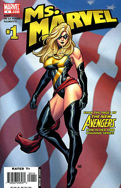
Gerry Conway wrote in the "Ms. Prints" introduction at the end of the first Ms. Marvel #1:
Like anyone who's been alive in the past decade or so, I'm aware of the tremendous changes occurring in society; and like anyone who's lived with those changes, I've changed myself. Only a fathead would call himself a reformed male chauvinist and expect people to take him seriously; that's not the sort of judgement a man can make about himself. One lacks perspective. Still of not totally liberated, I know enough to be aware that a problem exists, and to understand that we're all susceptible to chauvinism at times. Thus, approaching the character of Ms. Marvel, I bent over backward to put myself in her point of view, and because I'm a writer (and because injecting oneself into a character is the writer's craft), I believe I succeeded. Like I said, not so simple...He goes on to state that there aren't any "thoroughly trained and qualified women writers working in the super-hero comics field" and acknowledges that he's "alienated half a dozen talented women" by saying that. "There should be, no denying it, but there aren't."
It's an interesting snapshot of the comic book industry in 1977. I give him tremendous props for saying what he did. So if he was so mindful of what he was doing with this character, why, then, the peekaboo costume? He was the writer, so I can't lay the blame at his feet for that... but he was also the editor, so doesn't that mean the stuff was run past him first? So if John Buscema designed that getup, it had to be approved by Conway, the editor, right?
All of those women on the covers above are Carol Danvers. All of them are super-powered. But the 1977 version has the belly-baring (also back-baring, but you can't see it in that illustration) costume -- why was that necessary?
The 2006 version is cut high on the hips, has a bright yellow lightning bolt across her boobs ("hey, look at these!") and thigh-high boots -- why? This costume incarnation would be as suitable to a dominatrix as a superheroine. I love the way Cho drew the musculature, she looks strong and tight, but why is it necessary to bare her upper arms and upper thighs (and frankly, a fair amount of gluteus maximus)? She's got curves to identify her sex, why is it necessary to expose skin like that? For that matter, why is it necessary to so clearly identify her sex at all? (I feel compelled to point out that most women with very little body fat, as the heroines usually have, don't typically have ample breasts -- which are fatty tissue. How many chesty gymnasts have you seen?)
Only is Captain Marvel, from 2012, sensibly clad. The outfit is much more military in its styling, which is appropriate, since she was in the military. Still, she has a sash around her hips -- why? Because boobs weren't enough to let us know she's a woman? Don't get me wrong, I love the art and costume redesign for Carol/Captain Marvel, but why did we need the sash?
I am finding it very interesting to take a hard critical look at gender portrayals in comics. Some of the things we're discussing are things I'm familiar with already, having been exposed to some of the ideas before, but it's nice to hear other people doing it, too. Having a dialogue, not just me, muttering to myself.
_______
* We were also assigned Daredevil #1 (vol. 3, 2011), but that book doesn't figure into this post.


2 comments:
Your class sounds amazing. I have 2 comments. First, the second cover is drawn by Frank Cho, who is great as drawing powerful beautiful women. Yes, they are often overly-endowed and a little cheesecake, but I always find his character portrayals more empowering than objectifying. I know many will disagree, but those are my two cents. (That said, the bare upper thighs in the costume design are tacky). My second comment is about the sash. To me, it is nothing more than a signature costume flair. I never read into it as being a contraining declaration of femininity or anything. What i really liked in the new series is how they gave some backstory and functionality to the sash. The creative team on the new series is doing an awesome job.
OMG - thank you for pointing out my error! I've fixed it in the text. Ironically, I was just talking with a friend about Cho and his ability to draw strong and muscular women without making them look freakish. I don't know how I did that with the (digital) comic open while I was writing... Anyway, thank you.
Honestly, I'm not offended by the sash. It looks a bit like a skirt, and I could argue that a flight suit (which is basically what her costume is) doesn't need a skirt. However, aesthetically it looks nice. But the class isn't about aesthetics, it's about taking those hard looks at things we might otherwise accept out of hand because they've always been done that way. So, even though I like the way it looks, I am trying to question its necessity. Would such a sash exist on a Captain America who was male? Probably not...
As for the class, you can still sign up by 10pm EDT tonight I think. It's awesome, truly! The discussions are quite lively and interesting. Hope this link works... http://learn.canvas.net/courses/23 -- if not, hit canvas.net and search for Gender Through Comic Books. The class assigned readings are on sale through Comixology through today, too, if you have to grab anything that's not already in your collection.
Post a Comment